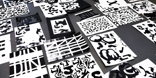
Self publishing - the stencil 2 - With Nick Deakin
 This time in Nicks process and production lesson we were using typefaces, stencils and black paints to create some interesting posters. Nick had set up the room so that the tables were on their side and acted as walls which meant there was lots of floor space too. There were three 'walls' each with a different typeface on. The first font I went to was Baskerville Bold Italic.
Nick told us to draw interesting elements of the font that we liked such as a ligature or curve of a letter, not the whole letter. I drew four shapes from the font and then cut them out to create a stencil. Then with black paint and a roller I painted the shapes onto an A2 piece of paper. At first I only painted a couple of shapes onto the paper because I thought we were only using one sheet of paper and layering the three letter types similar to the last lesson.
Therefore at the end of the lesson after finishing the other two posters I went back to the first one and I added more of the letters onto the paper because it looked way too sparse and I think it looks much more fuller and better now, but still has a good contrast of negative space.
The second font I went to was called DIN Alternate. This font was a lot more simple that the others. At first I thought this would make it more difficult to pick out good parts of the font but I actually found quite a lot of nice bits of the font.
Like before I drew them out and then cut them...
When printing the shapes onto the paper I decided to start in the middle and put the shapes tightly packed together, some even overlapping, and growing across the page. This turned out really nice and had good composition so in the end I was happy with it. Nick liked it and even made it onto the wall of fame at the end!
The last font was called Cooper Std and was very curvy and characteristic.
This font had quite a lot of nice elements and parts of letters. With these letters when printing onto the paper with paint I decided to position the letters in a curve. I liked how this looked and noticed that no one else had laid out there work like this. I was a bit annoyed that some paint smudged and got onto the white space making it look messier as I think it would look better being more cut clean. I also think that by accident these letters look like they could be spelling out the word 'vision'.
Below is all three of my posters created this morning. I enjoyed this lesson and I like how each poster looks so different due to the different fonts used, their thickness, their style and the layout.
At the end Nick selected a few of his favourites and talked about why he did. My second poster was on the wall and he said that he liked the composition.
Everyone laid there work out on the floor to let the paint dry but this also meant you could look at everyones work and it all looked really great together. There were some nice pieces made and it was a fun experimental lesson.


